-
 A LOGO WON'T MAKE YOU BUSINESS, A GREAT PRODUCT WILL
-
 But, whether you are a start-up or an established company, whether you’re creating a new brand or revamping an existing one, a strong tailored visual identity will make sure your business leaves a unique and lasting impression.
-
 At Dezakaya, we come from more than 15 years working in multinational agencies. We believe that the most creative and effective workflow happens when creatives and clients collaborate directly.
-
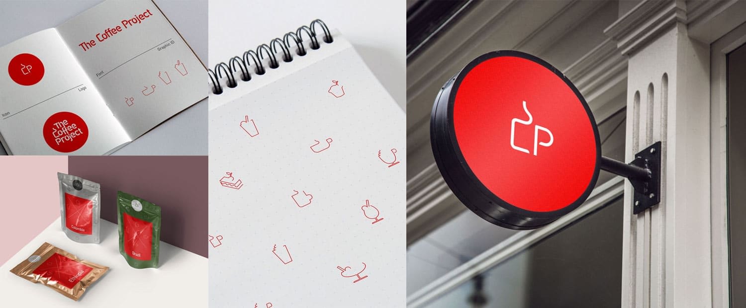
 We created a simple icon from their initials CP, inspired by a cup of hot coffee and developed it in to a simple but very noticeable identity. The logo also inspired a whole iconography representing the different types of hot and cold drinks and special desserts on the menu. We implemented our identity on their coffee cups, mugs, paper bags, cake boxes and cup holders, menu and interior of the cafe.THE COFFEE PROJECTLogo design, identity and branding
-
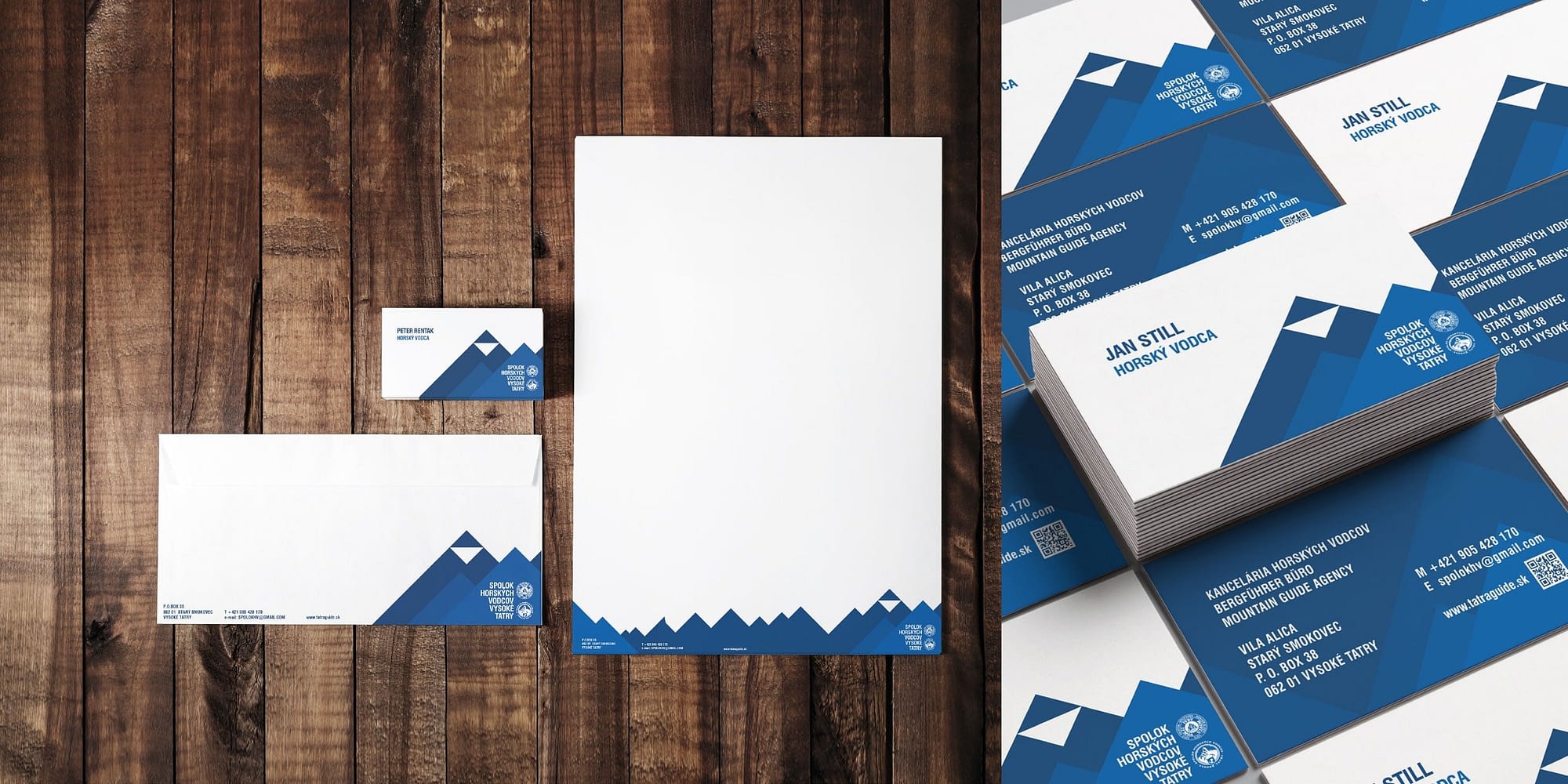
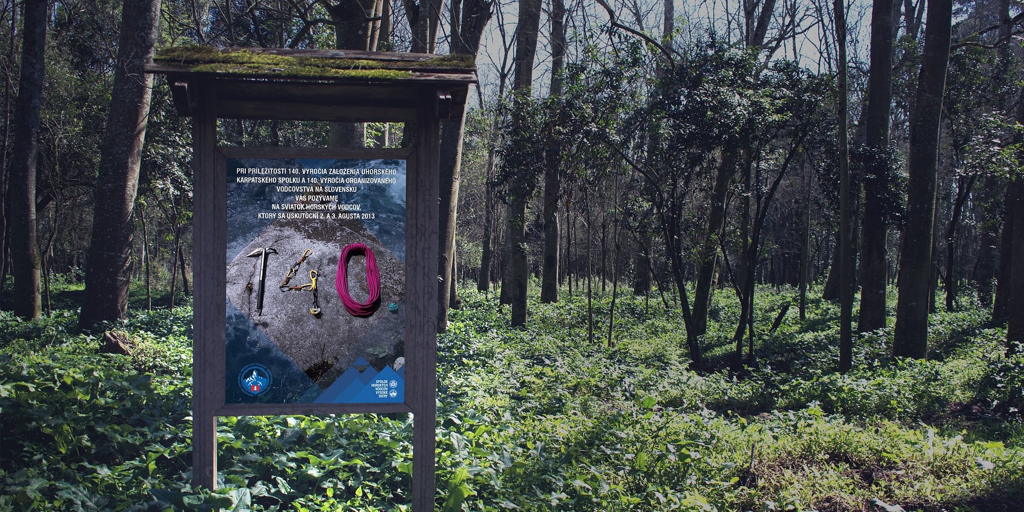 The Tatra Guides needed to refresh their identity. Having an official logo, they could not change, we focused on developing their template, as they had a lot of communication material, daily updates, events, bulletin boards, posters, stickers and business cards. We based it on the Tatra Mountain range, stylizing peaks into simple triangles with the highest and unique Mount Gerlach in the centre.TATRA GUIDESBranding and Identity redesign
-
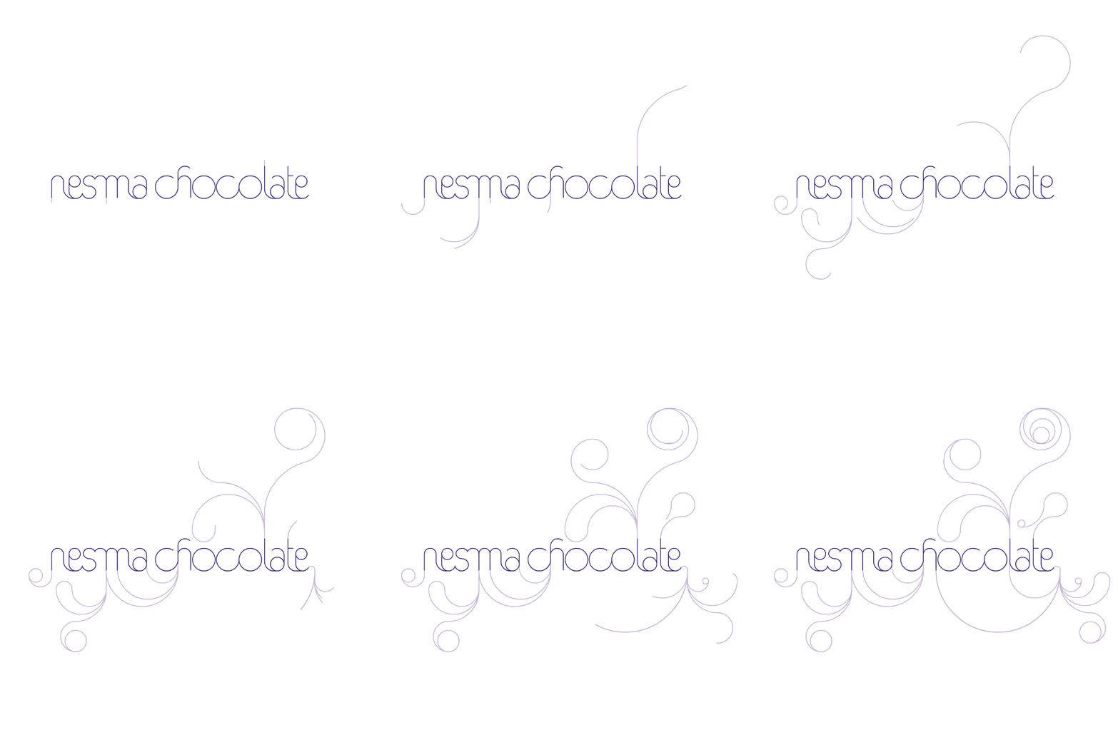
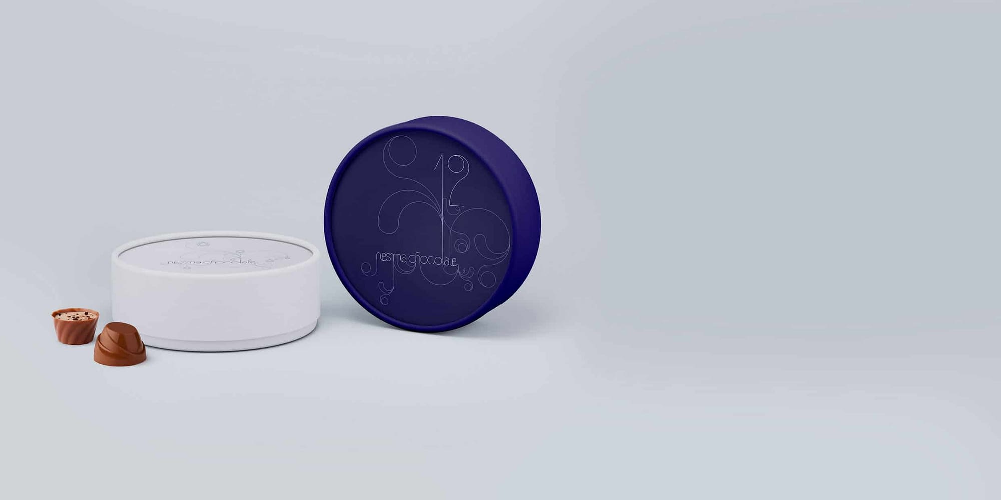 Nesma Chocolate wanted to relaunch their stores and needed a facelift of their logo design and a rebranding in a festive way adaptable to any gifting occasion. We redesigned their logo from scratch to ensure a very modern feel and developed the identity, used on the packaging, gift boxes and the store branding.NESMA CHOCOLATE - A FESTIVE RESTARTLogo design, identity and rebranding
-
 Our services cover logo and visual identity design, brand manuals and collateral design, website and digital applications, packaging design and signage.
-
 So whenever you are ready or if you have any other questions about working with us, fill up the contact form below or say hello@dezakaya.com and we will be in touch!
-
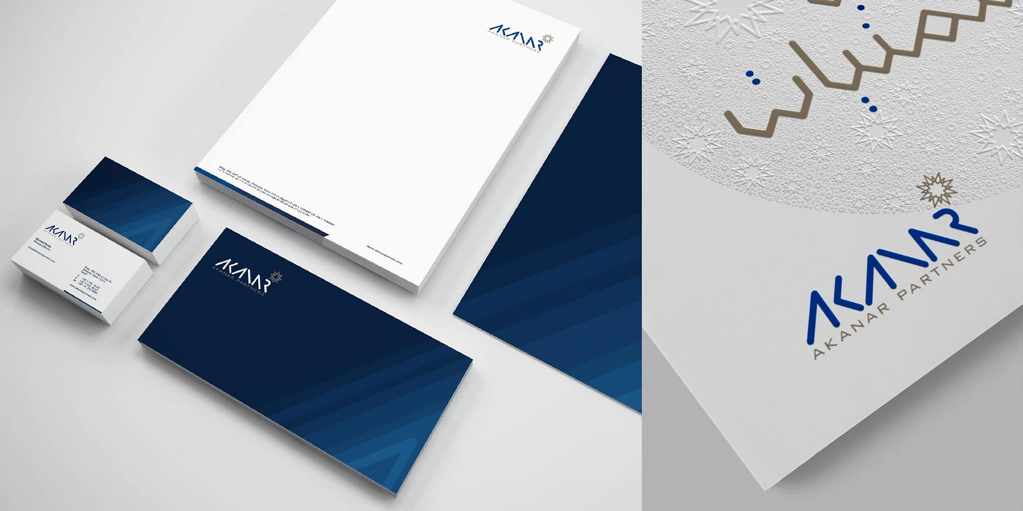
 Young company wanted to make an impact on the finance sector with fresh graphic identity reflecting their roots. Simple lines spelling out the letters in the logo with its roundedness gave it a futuristic look, while the blue colour symbolized prosperity in the finance sector and the colour of the Nile river. Guiding star was designed using arabesque geometric forms and identity implemented on stationary, business cards, letterheads, envelopes.AKANAR PARTNERSLogo design, identity and branding
-
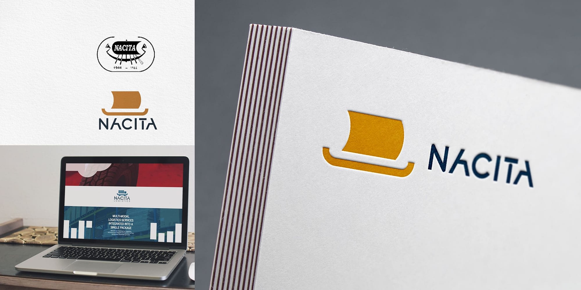
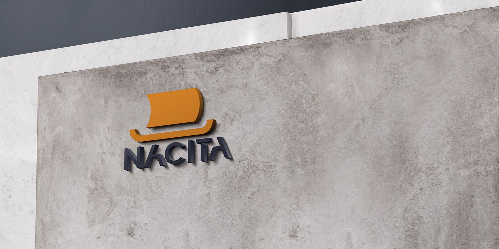 Nacita, a leading company in automotive and logistics services, wanted to modernize their identity. They wanted to update their logo, but also keep the legacy of that first icon, featuring a sailboat from the pharaonic era symbolising transport. We simplified what their icon represented to the most basic form. We also custom designed the font for NACITA to match the new icon. The simple forms allowed for easy rollout. Neon signs, hot stamp on letterheads and business cards, Website UI, and so on.NACITABranding and Identity redesign
-
 Sraz Youngtimerů is a yearly event gathering of classic car collectors from around Czechia, the youngtimers. Each car from this era had an iconic look, especially the “Grille”, recognizable even when presented in the most basic form. We designed logo using the cars grilles, stack over each other to form a totem. The”stackable” logo would then vary in size and car types. It would be flexible enough to adapt to any car collection or any event size.SRAZ YOUNGTIMERŮLogo design, identity and branding
-
 SOME OF OUR PROJECTS
