MaArtial is a team of experts in martial arts who, using a unique approach based on ancient principles, train and support people on their journey to improve their physical and mental well-being.
Their team approached us for help creating a visual style that would reflect their unique courses and inspiration to help people find inner strength.
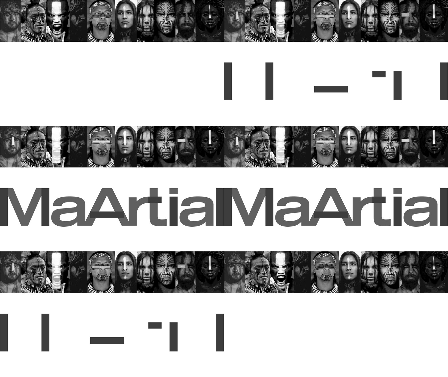
In a successful collaboration, we transformed their existing logo and integrated it into a fresh visual identity. The logo underwent expansion, resulting in a bold impression and enhanced stability. While maintaining a blocky aesthetic, the design incorporates rounded shapes for the letters “a” and “r,” adding a touch of refinement. The logo exudes a powerful sense of strength, characterized by its distinctiveness and easy recognizability.
Courage is a key skill that martial arts cultivate. It is characterized by the ability to push boundaries and try new things. Mental strength, endurance, and resilience against danger, fear, and hardships are the essence of a warrior.
Body and face painting were also part of their rituals.
Across diverse cultures, these ancient traditions served multiple purposes for warriors. They fostered spiritual and physical empowerment, provided protection, invoked strength and resilience, and, above all, symbolized the epitome of courage.
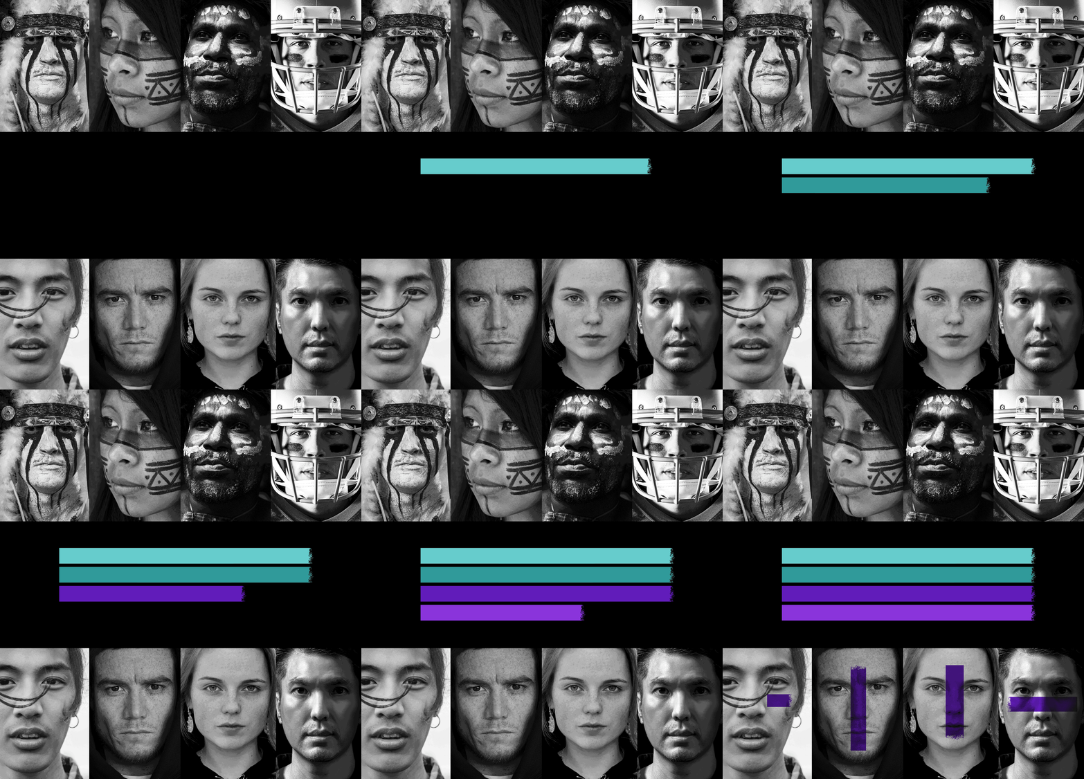
The graphic motif draws inspiration from the ancient tradition of warriors’ ritual face painting, which has been utilized across various cultures for centuries.
This powerful symbol of strength and courage remains relevant even in the present day.
In our identity, colors ignite profound emotions, embodying the dynamic interplay of black and white energies, reminiscent of the Yin and Yang principles. Green signifies wisdom and growth, while purple harmoniously blends the virtues of red and blue, symbolizing courage and the quest for a greater purpose.


